Design Principles
Design Principles
Colour Theory

RGB – Red, Green, Blue – primary colours typically used in digital design CMYK – Cyan, Magneta, Yellow, key – colours used typically for printing
Hue – Actual colour shown, includes primary, secondary and tertiary colours. It is the pure colour shown
Saturation – intensity of an actual colour, represents how bright and rich the colour can be.
Lightness- how much white or black is added to the colour to make it seem more darker or subdued
Tints – a colour that can overlay another, manipulating the original colour to appear as another. Its essentially adding white, a cool tint would be to add blue, a warm tint would be to add orange.
Shades – variations of a single colour manipulated in any theoretical way, lightness, tint, saturation or hue. How much black is added.
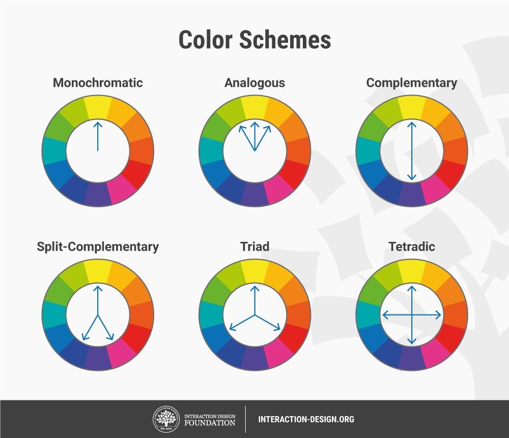
Monochromatic – A group of shades form a single colour, typically black and white.
Complimentary – Colours that are found on opposite ends of the colour spectrum but can be group together as colours that compliment each other
Analogous – colours found next to each other on the colour spectrum and can be consid- ered closely related. E.g. purple, blue and turquoise
Triadic – 3 colours that are in a triangular opposition to each other when found on the colour spectrum.
Primary – Colours not found by mixing, these colours are original that are mixed to create secondary and tertiary
Secondary – Colours found only by mixing primary colours. These can be a wide range of colours some would usually consider primary
Tertiary – Colours found only by mixing secondary and primary colours, usually more cmplex colours that require precise mixing.
Meaning of colour (links to culture)
Colour has natural effects on our emotions that is naturally instilled into our nature. For example Red is typically associated with danger or passion, Green is associated with nature and medicine and blue with calmness and wisdom. But beyond this there are cultural aspects that affect our reactions to colour – White is typically associated with death in India and yet in western society we find its associated with purity and peace.

Typography

Fonts – A style of text that is designed and presented in a particular way
Font families – Fonts that are the same within a group of variations – for example comic sans can be found in bold and italic. The design does not change but the individual letter- ing looks different
Serif – A type of font that is typically used in digital software with no inflictions it is simple an easy to read
Aesthetic appeal – making sure the fonts you choose fit the themes and overall mood of the site. also make sure it is readable
![]()
UI/UX - User interaction is more so about the display and visual encounter the user will have whether as the User experience is more so about the internal structure of the site - how it will work and how it navigates users. Both equally important for the overall usage.
Composition - Composition is the placement in which you lace a subject. When taking a photograph consider the position of the person or object you are taking the photo of
Balance - It is an extension of composition ensuring the image or whole display is in harmony and has a good general quality to iy

Comments
Post a Comment